Thursday, April 21, 2016

Rationale:

Rationale:
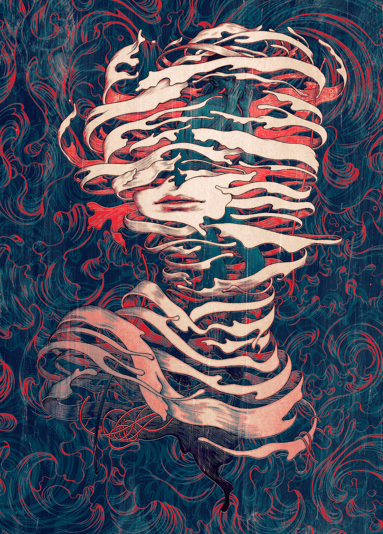
My movie for this project is The Fall. Because this movie was touching on surreal I decided my artist model would be James Jean. Most of his works are dreamlike and are striking. I chose to apply his detailed line style and minimal coloured works idea to my poster.


In The Fall, Alexandria and Roy go on a journey together through their storytelling. The characters they take with them visit a lot of different places. We are introduced to beautiful architecture and scenery. I was inspired by these visual elements and made them the focus of my poster.

I decided to have the buildings flow out of Alexandria’s head to symbolize that is where her story comes from. James Jean has many artworks with things coming out of people’s heads or people having multiple heads so I thought this idea tied in nicely with that. I chose to have her small in comparison to the buildings to communicate how much of a big mind she has and also how much of an impact it has on her.

I chose to have my poster very symmetrical to communicate Alexandria’s nativity and “straight forward” or “simple” thinking. I chose the orange colours to slightly reflect on the sand and older building colours seen throughout the movie. I played with the idea of the line work being orange also (or the whole composition completed in red) but I felt these colours didn’t suit that style as well as the blues that James Jean often used.

I chose red for the line work as red symbolizes love, danger and adventure. The love is between her and Roy for their friendship. Red is communicating the danger that Roy is to Alexandria throughout their relationship. The adventures they go through in their storytelling and in the real world are also communicated through this red.

For my marketing concept I created 6 bookmarks. These bookmarks are different coloured to represent different characters in the movie. (Orange and red: Alexandria, blue: Roy, yellow: the Russian, red: the Englishman, brown: the black man, green: the Indian).
I created bookmarks as my marketing idea as the movie does focus on Roy’s and Alexandria’s storytelling. With books, people are discovering new stories and ideas and this is where my bookmarks tie in with the movie. 

Wednesday, April 20, 2016

Final


Final Bookmarks

I decided to make bookmarks for all the main characters in the movie because I felt like two bookmarks weren't enough to portray my ideas. I chose to have each bookmark a different colour to represent a different character according to their costume (with an exception to Roy and Alexandria). 

The front of Roy's bookmark is in darker blue tones to represent his depression and addiction and the back is in lighter blues to communicate the his tense and sad turning point and the hope he now has. Alexandria's bookmark has red line work as red symbolizes love, danger and adventure. The love is between her and Roy for their friendship. Red is communicating the danger that Roy is to Alexandria throughout their relationship. The adventures they go through in their storytelling and in the real world are also communicated through this red. 

Wednesday, April 13, 2016

Feedback on 'Final' Composition (from Facebook)

"But I feel like its a bit top heavy if its supposed to be an equal/balanced composition. Maybe try moving that wall with the cutouts down into the middle? Or moving the title up? I feel like there's a slight missed opportunity to completely balance the composition."
Changes Made:

  • Diamond format
  • The cut outs are lower
  • More towers are at the bottom to balance out the big towers on top
  • Pushed the pyramid on top lower 

Change of Marketing Idea: Series of Posters to Bookmarks

I decided to change my marketing idea from a series of posters to a series of bookmarks. I felt like a series of posters wasn't adventurous and bookmarks suit the movie better. 

I'm creating bookmarks as my marketing idea as the movie does focus on Roy’s and Alexandria’s storytelling. With books, people are discovering new stories and ideas and this is where my bookmarks tie in with the movie. I will definitely have a bookmark for Alexandria and Roy but I am still toying with the idea of having book marks for the other characters.

Thumbnails: 

Rough Sketch of Final


Friday, April 8, 2016

Final Idea


Thumbnails After Feedback

I'm going to go with the bottom right thumbnail. Its a combination of this idea and one of my older thumbnails.

Style: 
I've finally settled on a James Jean style too. I want the poster be in the same style as the work below (one colour poster, line work etc) and for the negative spaces has a very faint patterned background like the waves work (mine would be of butterflies though).


Interim Presentation:


Feedback:

  • Colour palate is nice
  • The text isn't right for that vertical format (try creating your own font, research fonts, and positions) Maybe have 'Fall' slightly diagonal from left to right
  • Too much negative space at the bottom right (look into subtle textures, imagery etc to put in there) (butterfly texture??)
  • Alexandria is a positive and naive character (look at re-positioning her head to look up at the architecture, put her head lower in the lower right corner)

Thursday, April 7, 2016

Marketing Poster Ideas

For my marketing concept I am looking into the idea of having another poster that fits with my final one. I will consider playing around with the idea that each character gets a poster but I don't know if I will go down that track. 


Monday, April 4, 2016

Narrowed Down Thumbnails

While planning my thumbnails I've been using James Jean's compositions and ideas to help form my own. He has heaps of styles so I need to narrow down what style I want for my poster design. I need to chose a style that suits my ideas and composition and also that I know I can achieve. 

Thumbnail 1: Influenced by this James Jean work. This style could also work really nicely with my idea.
This style would be good too. Its more loose/ gestural but also has some nice line work in there.
Thumbnail 2: This style suits the falling feel to the idea and composition. The thumbnail seems empty and has a lot of negative space but with this style the background will have more interest. 
Thumbnail 3: If I used this thumbnail idea I'd use this style for it. The background on my thumbnail would be livened up with opposite colours. An ambiguous background. 
Thumbnail 4: For this thumbnail I'd use the plain/lighter colours for the girl and the background would be like this. Darker, abstract and mute. It would put all the attention on the main imagery. 
Thumbnail 5: The idea from this James Jean work: This style would work really nicely with the buildings on my character's head too.
I could use the idea from this work: the person's face is very simple, plain compared to a complex background with multiple colours. 
This could be an interesting style for my poster. The face could be softer and the background too and the line work would be a nice contrast for the buildings framing the face. 

Thumbnail 6: Because this thumbnail is just architecture based, I thought the style above would suit it and also possible have the colour fade like the painting below could be interesting.