While planning my thumbnails I've been using James Jean's compositions and ideas to help form my own. He has heaps of styles so I need to narrow down what style I want for my poster design. I need to chose a style that suits my ideas and composition and also that I know I can achieve.
Thumbnail 1: Influenced by this James Jean work. This style could also work really nicely with my idea.
This style would be good too. Its more loose/ gestural but also has some nice line work in there.
Thumbnail 2: This style suits the falling feel to the idea and composition. The thumbnail seems empty and has a lot of negative space but with this style the background will have more interest.
Thumbnail 3: If I used this thumbnail idea I'd use this style for it. The background on my thumbnail would be livened up with opposite colours. An ambiguous background.
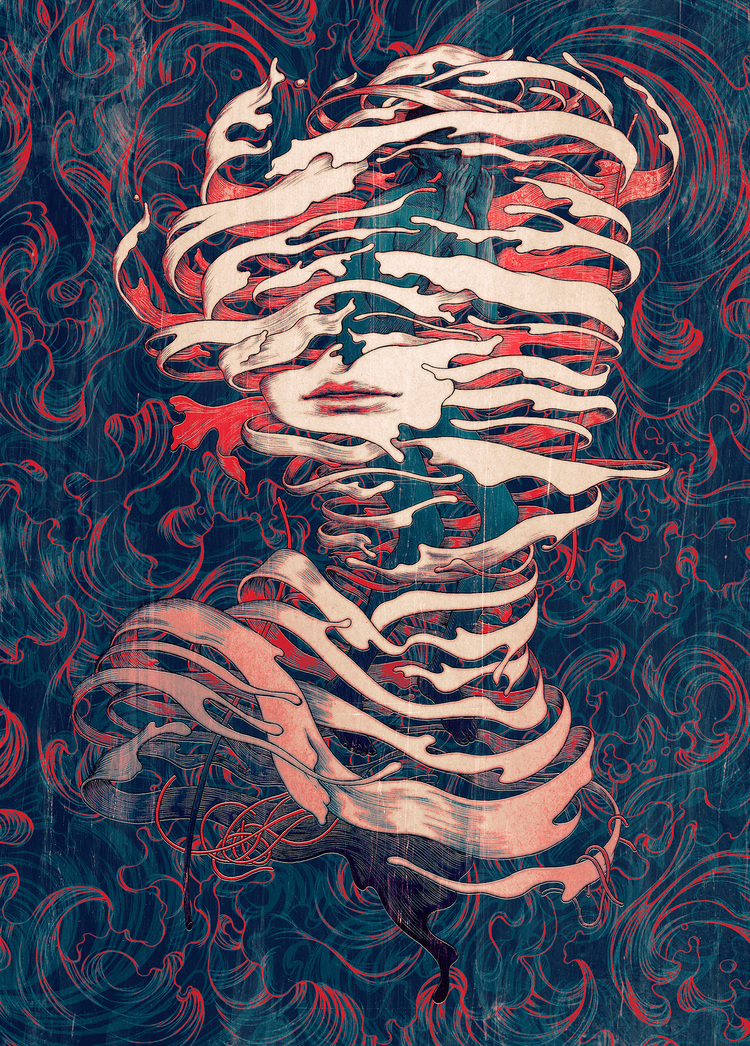
Thumbnail 4: For this thumbnail I'd use the plain/lighter colours for the girl and the background would be like this. Darker, abstract and mute. It would put all the attention on the main imagery.
Thumbnail 5: The idea from this James Jean work: This style would work really nicely with the buildings on my character's head too.
I could use the idea from this work: the person's face is very simple, plain compared to a complex background with multiple colours.
This could be an interesting style for my poster. The face could be softer and the background too and the line work would be a nice contrast for the buildings framing the face.
Thumbnail 6: Because this thumbnail is just architecture based, I thought the style above would suit it and also possible have the colour fade like the painting below could be interesting.


No comments:
Post a Comment